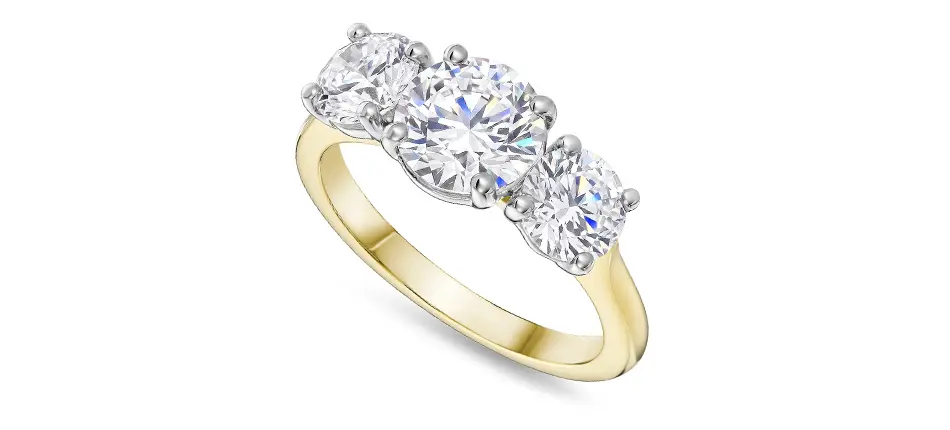
How to Photograph Gold Jewellery So the Colour Is Actually Accurate
This article is part of our Jewellery Product Photography guide. Here we go deep on the colour science behind the returns problem: why gold shifts colour in photos, and the calibration workflow that stops it.
Why Gold Is So Easy to Misrepresent
Yellow gold, rose gold and champagne gold cluster tightly together in colour space. They share almost the same hue family, a warm yellow-orange, and differ mainly in saturation and lightness rather than hue itself. That narrow separation means a small white balance error or exposure shift is enough to push one alloy's rendering into another's territory on screen.
Metamerism makes this worse. Two physically different colours, or the same piece under two different light sources, can appear to match under one light and diverge under another, because every surface has its own spectral reflectance curve. For photography this shows up as illuminant metamerism: a rose gold ring shot under warm tungsten light can visually drift toward yellow gold, then look correct again under daylight. Polished, reflective metal adds a second layer, geometric metamerism, where colour appearance shifts with the viewing or lighting angle — which is why a single polished gold piece can show noticeably different colour casts across its own surface depending on which facet is catching the light.
Fixing White Balance at the Source
Auto white balance estimates a scene's neutral point statistically. A small, highly reflective, warm-toned subject like gold jewellery often has no true neutral point anywhere in frame, so the camera's guess is unreliable and inconsistent from shot to shot. The fix is a custom white balance: place an 18% grey card, or a dedicated white balance target, in the same light as the piece, expose a frame of it, and either set a custom in-camera white balance from that frame or use the eyedropper tool on the neutral patch during RAW processing. Re-check the card any time the light itself changes — a different modifier, a dimmer adjustment, or drift in a continuous LED source.
Building an Actual Colour Profile, Not Just Guessing
Beyond white balance, professional colour-critical work uses a reference target: X-Rite's ColorChecker Passport Photo or ColorChecker Digital SG, or Datacolor's SpyderCheckr, are patch charts of known, certified colour values. The workflow is straightforward: shoot the target once under the session's fixed lighting at the very start, then use the target's companion software, or a Lightroom or Camera Raw plugin, to build a custom camera profile specific to that camera, lens and light combination. That single reference shot becomes the source of truth applied across every subsequent file in the batch, which matters enormously once a shoot covers dozens of SKUs rather than one hero image.
The Invisible Step: Monitor Calibration
Hardware monitor calibrators, such as X-Rite's i1Display Pro or Datacolor's SpyderX, measure a screen's actual output and correct it against a known standard rather than trusting factory settings or an eyeballed adjustment. Without this, it's entirely possible to edit an image on a display that's secretly a little too warm, too cool or oversaturated, so the file looks correct on screen but is measurably wrong in the delivered sRGB file. That mismatch is invisible at every stage of editing and only surfaces when the customer opens the box and the ring doesn't quite match the product photo they bought from. Calibrating roughly monthly, and always before a location or remote editing session, catches this before it becomes a returns problem rather than after.
Pick a Kelvin Value, Then Don't Move It
Jewellery is typically shot in the 5000K–5600K range, close to daylight-balanced, for neutral, true-to-metal rendering, though some studios deliberately shoot closer to 3200K tungsten specifically for warmer yellow-gold pieces. The exact number matters less than the discipline: holding one fixed colour temperature and one colour profile across every single SKU in a session. Drift is invisible on any one shot in isolation and becomes glaring the moment fifty products sit side by side on a category page and the same alloy reads as three different metals depending on which day it was photographed.
RAW, ICC Profiles, and Why sRGB Is Correct for the Web
The standard chain is: shoot RAW, apply the custom camera profile built from the ColorChecker or SpyderCheckr reference shot, edit on a calibrated monitor, then soft-proof and convert to the output colour space before export. For e-commerce delivery, sRGB is the correct target, not Adobe RGB. Adobe RGB covers a noticeably wider gamut, but most browsers, consumer displays and phone screens assume sRGB, and delivering an Adobe RGB file without a correct embedded profile causes visibly desaturated, shifted colour the moment it's misinterpreted as sRGB by the customer's device.
Why Saturation Is Not the Fix
Pushing saturation to make gold "pop" in the edit is one of the most common mistakes, and it makes the underlying problem worse, not better: an oversaturated edit diverges further from the calibrated, accurate capture rather than correcting it. Better practice is to use vibrance sparingly, keep saturation adjustments minimal, and resist the temptation to fix a dull-looking gemstone or metal by cranking saturation rather than correcting exposure and white balance properly at the point of capture.
This Is a Returns Problem, Not Just an Aesthetic One
Independent survey data backs up what most e-commerce jewellery brands already suspect: research from Akeneo covering 1,800 consumers across eight countries found that 40% of shoppers had returned a product in the past year specifically because of incorrect or misleading product information, with 53% abandoning a purchase over inaccurate product data, and misleading images specifically flagged as a driver. Jewellery, where colour is often the single deciding factor between two near-identical pieces, sits at the sharper end of that problem — which is exactly why colour accuracy belongs alongside sharpness and lighting as a core discipline, not an afterthought in editing.
More in This Guide
- Focus Stacking Jewellery Photography — Getting a whole ring or pendant sharp at macro distances without halos.
- Lighting Reflective Jewellery — Controlling polished metal reflections while still making gemstones sparkle.
- Building a Consistent Jewellery Catalogue — Making every SKU in a growing catalogue look like it belongs to the same family.
- ← Back to the full Jewellery Product Photography guide
By M.O. Studios — Birmingham-based jewellery & product photography studio Published 12 August, 2026