The Amazon Myth That’s Quietly Sabotaging Your Sales
How Amazon Accidentally Became the Rulebook for Everyone
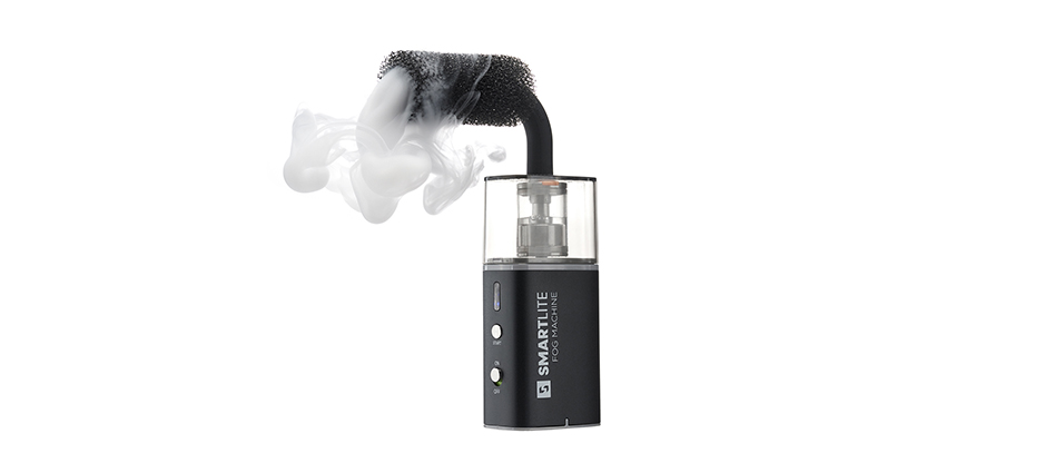
The ultra-clean, tightly cropped product image has become the unofficial standard across e-commerce. Brands use it instinctively, rarely stopping to ask why this look became the norm.
The influence comes almost entirely from Amazon. Its interface is built around a white page, a compact layout and thumbnail-heavy navigation. A product image that isn’t tightly cropped feels messy within that structure, so the crisp pure-white approach makes complete sense on Amazon’s platform.
When You Apply Amazon’s Rules to Your Own Website, Things Break
Here’s the part many brands overlook: what works on Amazon often works only on Amazon.
New online retailers, especially those launching their first store, tend to adopt the same visual rules. They crop images to within an inch of the frame, bleach the background to absolute white, and then wonder why the photos feel jarring or strangely aggressive on their beautifully designed website.
It’s easy to point the finger at the photographer, but the real issue is a mismatch between the image and the environment it lives in.
Photography Should Match Its Context, Not an Unrelated Marketplace
A product photo doesn’t exist in a vacuum. It sits within your page layout, surrounded by typography, brand colours, spacing and UX design choices.
A crop that feels tidy on Amazon can feel intrusive on a full-width product page. Instead of elegance and breathing room, the product ends up shouting at the customer. Luxury cues vanish. Brand confidence evaporates.
This isn’t a creative failure, it’s a context failure.
Why Pure White Isn’t Always the Best Background
White is considered the industry default, but it’s never been a requirement.
For jewellery especially, a slightly warmer off-white or a soft grey can make metals and gemstones appear brighter and more refined. A tiny shift in tone can elevate a £50 piece to feel like a £5,000 one. Subtle adjustments like this play a huge role in perceived value and click-to-cart behaviour.
The Only Rule That Actually Matters
Match the photography to the platform where it will be displayed, not to the standards of a retailer you might not be selling on at all.
When your visuals work in harmony with your website, the product feels intentional, premium and credible. That alignment doesn’t just make your store look better; it improves conversion.
The Real Takeaway
Don’t copy-and-paste Amazon’s standards into your brand just because they’re familiar.
Your website isn’t Amazon. Your customers aren’t shopping on Amazon. Your photography should tell your story.
Your site, your aesthetic, your rules.
By M.O. Studios 05, December, 2025
Leave a comment:
F.A.Q.
1. Why do so many online stores use Amazon-style product photos?
Many brands copy Amazon’s visual standards by default: pure white backgrounds, tight crops and edge-to-edge framing. Because Amazon is so dominant, its layout and rules have become an unofficial template for e-commerce photography, even for retailers who don’t actually sell on Amazon.
2. Can Amazon-style images hurt the design of my own website?
Yes, they can. Tight, cropped-to-the-edge product photos are designed to sit in Amazon’s busy, white interface. On a carefully designed standalone website, those same images can feel harsh, aggressive or out of place, especially when displayed larger or with more breathing room.
3. Should my product photography be different on my own site compared to marketplaces?
Ideally, yes. Marketplaces like Amazon have strict visual requirements that suit their layout, but your own website has different spacing, typography and brand colours. Your product photography should be tailored to your site’s design so it feels consistent, premium and intentional.
4. Is a pure white background always the best choice for jewellery photography?
No. While pure white is a common standard, slightly off-white or light grey backgrounds can make metals and gemstones look more luminous and high-end. Subtle shifts in tone can significantly change perceived value and help a piece feel more luxurious on the page.
5. How does context influence whether a product photo works or not?
A product image never exists in isolation; it’s part of a full layout that includes fonts, colours, spacing and UX elements. A crop that feels clean on Amazon can look overwhelming or “in your face” on a full-width product page. Matching the photo style to its environment is key to a cohesive experience.
6. What’s the main rule for choosing the right e-commerce photography style?
The most important rule is to match your photography to the platform it will live on, not to another retailer’s standards. When your images are designed for your own website, they support your brand story, enhance the user experience and ultimately help your products sell better.
Matt Cane2025, 07 December
Wow what a perspective!
M.O. Studios2025, 07 December
Thanks...